


Global Head of Brand Design Rasmus Wangelin Explains the Creative Behind Spotify 2021 Wrapped
Spotify Wrapped: You eagerly anticipate its arrival. You swoon over the in-app experience. You share your results on your socials. You snicker when you see the ads during your commute. But do you know what goes into Wrapped’s unique visual identity each year?
Many months ahead of Wrapped’s December launch, Spotify’s Brand & Creative team comes together to refresh Wrapped as a true campaign and experience that reflects on the year with its own unique look and feel. To get the scoop, For the Record spoke with Spotify’s Global Head of Brand Design Rasmus Wangelin. He shared the considerations he and his team put into Wrapped year after year—and what’s special about the creative for 2021.
What is your role within the Spotify Brand & Creative team? How does your work throughout the year transition into Wrapped?
In collaboration with my team, I oversee Spotify’s design work for brand and marketing globally. I run a team of between 15 and 20 designers, art directors, and design directors working alongside me across different initiatives. They can range from brand marketing, music and podcast marketing, art direction and branding, design thought leadership, and problem solving any design-related issues for the company as a whole. We really work and collaborate with almost all parts of Spotify. We’re also always proactively working in the background on the brand itself—the rules around it, guidelines, how it comes to life.
Wrapped is probably the biggest project we do every year. And it’s not like other projects end—but because we know Wrapped is coming, we have to orchestrate and organize our team to be able to support it properly, alongside everything else that we still have going on.
And funny enough, design explorations for Wrapped actually start in June every year. We have to start that early in order to land the design direction so that we can then build an extensive tool kit that will be used by all of our partners and agencies globally.
What are some of the considerations that go into the Wrapped visual identity each year?
I think there are a few different answers here. I think the most important one is that the way we tell the story of music and audio culture every year shifts, right? So we actually want to look at the year that has been and align our way of talking and our ideas with the year. As you can see, every year has a slightly different theme. And it’s important for us on the design front to make sure that whatever design we create matches the sentiment of the way we’re talking about the year conceptually.
And then outside of that, we actually aspire to create a completely new and fresh articulation of our brand every year. That is Spotify. We’re always inventing, trying things, and exploring how we can push the brand. So when you go through the years and you start backtracking on Twitter and Instagram and all these different places that you can post, you can almost visually see what year you’re talking about based on the art direction.
Of course we’re always thinking about all the obvious things like accessibility and creating a design that feels inclusive enough for everyone to understand it. We work closely with a lot of different teams at Spotify, and we bring them in as stakeholders to make sure that we get feedback from different places with different expertise really early in the process. We’re a digital-first company, so we are always thinking about how we can create impactful work across all of our digital touchpoints. So, for example, motion is always a key part of our design.
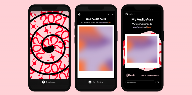
What are some of the specific elements within the identity for 2021 Wrapped? What should fans look forward to?
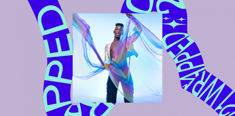
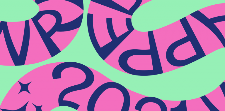
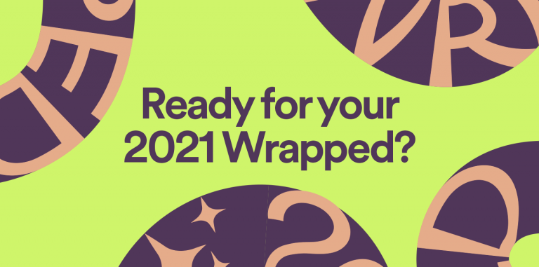
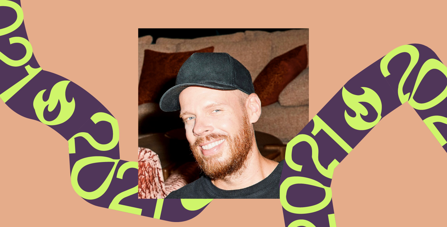
The graphic element this year for Wrapped is a dynamic thread that ties together all the work. When we started looking at this as a design element, we were super excited because it gives us an additional layer of storytelling in every piece of creative. You can, let’s say, have an artist image with copy, but you can also have things inside of this ribbon to enhance the story and go deeper with an insight.
Sometimes we will put words like “2021” or “Wrapped,” but it also gives us an opportunity to actually lean in even further and have a bit of a dialog with our audience. We’ve created a set of standard symbols, like a heart or a fire, but we’re also giving local markets an opportunity to create their own custom symbols. We had so much fun with this piece when creating the work and we love the idea that some symbols might only be fully understood by a true fan. We’re massive music fans ourselves. Everyone who works at Spotify is very in tune with music and music culture, and we want that passion to shine through.
How does the 2021 Wrapped visual identity reflect 2021 as a whole?
This year, people around the world started to embrace the unknown in many ways, so we wanted every piece of creative to feel unique. At the same time, consistency is always important for a large campaign like Wrapped, and the playful ribbon does a good job at creating unique articulations while tying together the work as a whole.
This year, as you enjoy the new and familiar elements of the Wrapped in-app experience or explore what the world streamed most this year, make sure to take a look as well as a listen.