


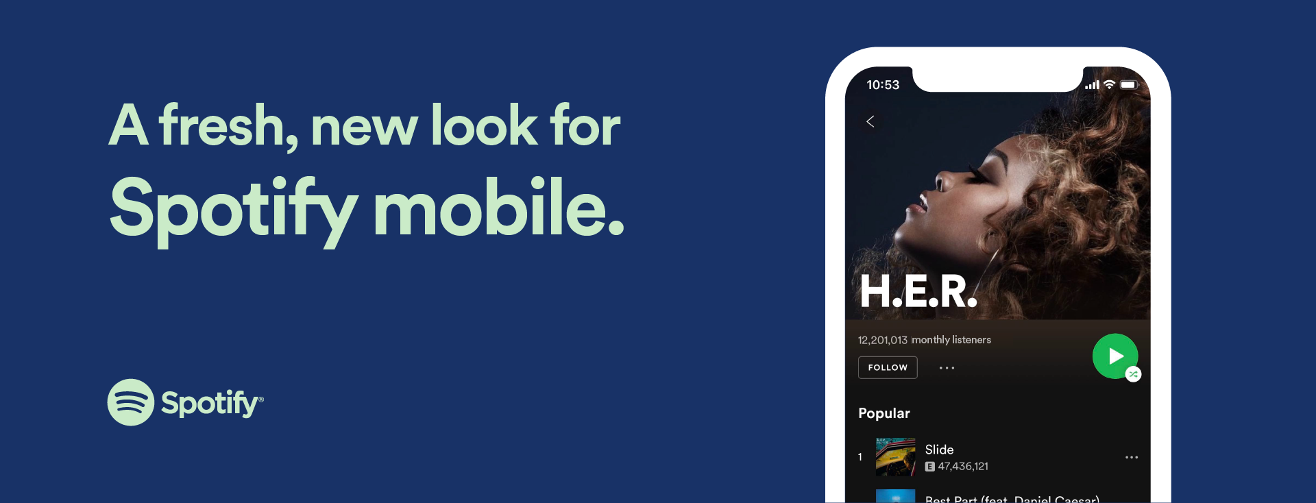
3 Icons to Know in Spotify Mobile’s Refreshing New Look
It’s bigger. It’s bolder. It’s better than ever. No, we’re not talking about some artist’s new sound, but about the refreshed look that iOS users will enjoy on Spotify mobile starting today. Both Free and Premium subscribers will benefit from a more streamlined, easy-to-use interface with fresh designs to actionable icons that will make playing your favorite song or playlist as simple as the tap of a button.
Get to know the new designs for the elements you use every day that will be rolling out through the update.
Simpler and more universal Shuffle Play button

Our new green “shuffle play” icon reduces streaming to the click of one familiar button, which includes the shuffle icon.
Easy to use Action Rows

All actions, including ‘like,’ ‘play,’ and ‘download’ for Premium users are grouped in a row at the central part of the screen. Plus, downloading for listening without Wi-Fi (for our Premium users) now has a new icon—the same one we’ve been using for podcasts. Plus, the new row is your one-stop-shop for everything you’ll ever want to do one-handed—the experience is much more adaptive and responds to the size of your device.
New Track rows with cover art
We’re now showing a track’s cover art in all views except “Album” view. This will make it easier than ever to navigate the app and find familiar songs. Plus, we’ll highlight songs you’ve already “liked” by showing the heart icon next to the track name.
Starting February 27, iOS users of Spotify mobile can access and navigate music like never before. Now that you know what to look for, it’s time to get streaming.